
The bedding edit · Bedroom styling
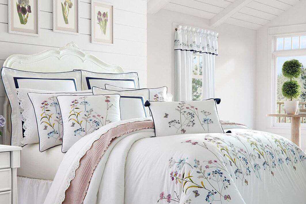
Soft-edged petals and washed colours can make a floral quilt cover feel easy to live with. For an autumn bedroom, the aim is to give that print a little depth while keeping the room calm. You can often do this with the sheets, throw and cushions you already own.

01 / Bedroom styling
Choose the scale and background first
Look at a full-bed photograph before a fabric close-up. A large, open floral has a different effect from a small repeat, even when both use blue and white. Consider how much of the design will remain visible once pillows and a folded throw cover part of the bed.
A white or pale background gives the pattern breathing space and works well beside timber, cream walls and simple furniture. A charcoal, navy or deep green background makes the same kind of botanical motif feel more enclosed and dramatic. If the room already has patterned wallpaper or curtains, a floral with fewer colours or more empty space is easier to balance.
02 / Bedroom styling
Build a small palette around the cover
Take the background colour into the sheets or pillowcases, then choose a secondary colour for one smaller accessory. For example, a white floral with dusty blue leaves can sit with white sheets and a blue throw. A print with rust petals and olive foliage can work with a plain olive cushion and a neutral sheet.
Match the undertone rather than chasing an exact colour match on a screen. A warm cream can look quite different beside a cool white. Compare pieces in the room during daylight and under your evening lights before buying a complete collection.
- Light and airy: a pale floral, plain light sheets and a restrained accent.
- Blue and white: repeat one blue tone, with natural timber or a woven basket nearby.
- Dark botanical: keep the surrounding bedding plain so the print remains clear.
03 / Bedroom styling
Add texture and useful autumn layers
Try one tactile layer at the foot of the bed: a knitted throw, a plain coverlet or a textured cushion. Keeping it in a solid colour lets the watercolour edges stay visible. If you enjoy mixing prints, vary their scale and give them a shared colour; a small stripe is usually easier to coordinate than another large floral.
Separate styling from temperature. A rust throw can suggest autumn visually, but its fibre, construction and weight determine how it feels. Use a quilt insert that suits your room and sleep preferences, then add a removable layer for cooler nights. Avoid piling on decorative pieces that have nowhere to go at bedtime.
04 / Bedroom styling
Check the fabric, size and daily routine
Watercolour describes the appearance of the print, not the fabric. Check the front and reverse composition, surface texture and care label. The side touching you may feel different from the printed face. Look for a reverse photograph too, particularly if you plan to fold the cover back.
Match the cover dimensions to your quilt insert and check the set contents. A styled photograph may include separate European pillowcases or cushions. Before ordering, ask whether the cover will fit your washing machine and drying space. A design you can wash and remake comfortably is more useful than a room that only works in a photograph.
Styling
A simple floral bedding palette
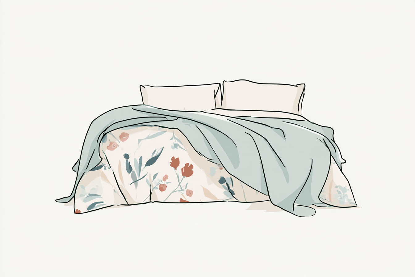
Choose the main floral design.
Repeat its background in plain bedding.
Pick one smaller colour for a throw or cushion.
Let one floral be the focal point, then give it space.
Common questions
Can floral bedding work in a small bedroom?
Yes. Consider the print’s contrast and empty space as well as its scale. Plain nearby surfaces and a limited palette can help the bed sit comfortably in a smaller room.
Do autumn florals have to be dark?
No. A light floral can work throughout the year. Add an earthy accent or a textured removable layer if you want a seasonal change.
Should all the pillowcases match the quilt cover?
They can, but plain coordinating pillowcases also work. Check the product photographs and inclusions so any separately purchased pieces are intentional.
Find your floral starting point
Compare the complete design, reverse fabric and included pieces before choosing a set.