Using coloured cushions to brighten up your home
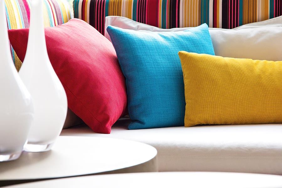
Cushions are the perfect way to quickly spice up your home with colour and vibrancy, without making any permanent changes. You can quickly add or remove coloured cushions to provide a drastically different look and feel in moments.
On the other side of the coin, sometimes it’s easy to go overboard with the colour. Or, worse, combine clashing colours that create an unpleasant, unwelcoming appearance.
Whether you’re looking for a change of style, need to streamline your current coloured cushion selection, or simply want to explore options, this guide is here to help.
Let’s explore the vibrant world of brightening your home with coloured cushions.
Firstly, let’s look at the meaning of colours
Different colours have different moods and feelings associate with them. These associations are sometimes cultural, or sometimes purely personal. Whatever their true nature, they allow us to use colour to communicate without saying a word.
Below you’ll find the traditional colour associations:
WARM COLOURS
Yellows, oranges and reds. The colours of sunrise and dawn, they frequently inspire people to act and be motivated.
- Red:Passion, love, importance, flame
- Yellow: Sunshine, hope, joy, neutral gender
- Orange: Energy, creative, change (frequently associated with Autumn), health and vitality.
COOL COLOURS
Blues, purples, and even green fall under the “cool” colours category. They traditionally evoke a sense of soothing calm, and can be used to create a relaxed feel in a room.
- Blue: Strength, calmness, reliable, melancholy
- Purple: Royalty (was frequently reserved for the upper echelons of ancient Roman society), luxury, romance, imagination.
- Green: Nature, harmony, newness and wealth
NEUTRAL COLOURS
These are the colours typically used as the background or base of a design. They complement most of the above colours, and can be used in conjunction to help the other colours stand out bolder. They can still be powerful statements on their own, or combined with other neutral colours.
- Black: Power, formality, elegance.
- White: Purity, virtue, simplicity
- Grey:Modern, professional, conservative
- Tan/Biege: Adaptable, conservative, simplicity
When to use, and not use, colour
Where do you draw the line when it comes to adding colour? How much is too much or too little? It can be intimidating to start with. You want to add life and vibrancy, but you don’t want to give people a headache.
Start by keeping the general associations above in mind. You don’t want to say “too much” or any of the associations. Too much red, for example, can go from “passion” to “rage” and actually make people feel irritable.
The simplest advice is to start small and build up. Add one or two coloured cushions of your desired colours, and see how it looks. You’ll be surprised at how little you actually need to completely reinvigorate a space and create a romantic bedroom vibe.
The more neutral the colour, the more of it you can add. You will get away with more subdued teal than bright royal blue, for example.
Think about off-setting colours already in your space. If you have a brightly coloured couch, go for a neutral colour cushion; if you have a neutral colour cushion, add a splash of warm or cool colours to it.
Don’t add too many colours together (more on that later). Neutral goes with almost everything, but warm and cool colours can clash if you’re not careful. That being said, the right combination of cool and warm colours can provide the best results. It’s all in experimenting to see what works.
Outdoor settings can get away with brighter colouring, as they will need to compete with the outdoors. Bright blues and reds will contrast nicely with a vibrant green garden setting, while neutral colours can blend effortlessly with stone.
Mixing colours
Colour mixing and matching is a skill that you’ll either pick up quickly, or tear your hair out over for years to come.
Some general tips:
- Neutral colours match with most things, hence the name. Black can be used to enhance the vibrance of colour of other objects through contrast. White will actually make bright colours stand out less, so can be used to “tone down” a room.
- Softer colours will often blend well together. A soft warm colour like mustard will readily suit a soft cool colour like teal.
- While warm and cool colours are contrasting and complementary, beware. Teal and orange is a very pleasing combination, while red and green can actually be quite glaring (and of course, will look like Christmas.)
Coloured cushions at Manchester Collection
At Manchester Collection we have over 140 cushions to choose from. There is a wide selection of colours, styles and textures to create or complement your unique aesthetic.
Our extensive range of beautifully individual designs includ the latest season styles and trends that will refresh and invigorate your living space. Or, if it’s a classic and timeless style you want, our collection of Elegant Cushions will effortlessly last through the seasons.
From luxuriously embellished beaded and diamante cushions, across minimalist designed ones to fit your low-design style to bold, contemporary geometric prints and beautifully textured woven cushions, we’re sure there’s something to suit all tastes.
Shop Online now for Coloured Cushions